Global Warming: Visualized
Published 5 years ago - 14.6k plays
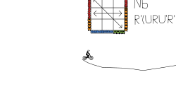
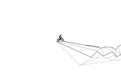
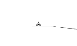
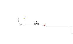
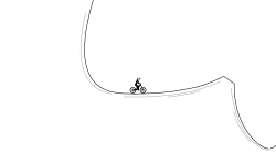
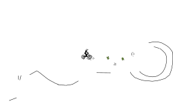
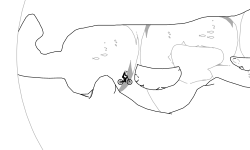
here it is, the complete track. from 22,000 years ago until now, this is a giant line graph showing earth's average temperature, along with envisions on what the future could look like. the end may surprise you, and i hope you enjoy! graph made using randall munroe's xkcd, one of the best webcomics!
Desktop Controls
- Accelerate
- Back Brake
- Lean Left
- Lean Right
- Change Direction
- Change Vehicle
-
Front Brake Advanced+
- Last Checkpoint
- Remove Checkpoint
- Restart Track
- Pause
- Zoom In/Out or
-
Toggle Player View Race mode only
CURRENT RACE
| 1. |
|
2:02.63 |
Loading Leaderboard


1 day ago
xX_RIP_Xx ye
1 day ago
SynxA2 yup we are
4 months ago
we are cooked
4 years ago
ChewieChewington :)